A banner stand is an effective, high-impact way to advertise a brand, product, or service. When done right, you instantly create awareness and begin building leads in any room of consumers.
With that said, there are good and bad examples of banner stands out there. As an exhibitor looking to create the ultimate banner stand advertisement, you need to find the right balance between design and practicality. The banner stand should be physically appealing, yet convey the brand’s message in a clear and concise way.
Here is how to design a banner stand in nine simple steps:
1. Banner size
Before we get crazy with a banner stand design, first things first, you need to know how much size you have got. There are smaller banner sizes which can complicate more complex design ideas you may have. The size of the banner stand can depend on a lot of things so be sure you have a very accurate grasp on how much space there is.
2. Banner aesthetic

Commit to a unified look you’re going to communicate across the entirety of your banner stand. You may want to look at banner stand examples, your own brand graphics, or graphic aesthetics to determine what sort of look or vibe you’re reaching for.
Everything should seem natural together. For new brands who haven’t yet established a clear design aesthetic for themselves, your banner stand is going to force you to make some decisions.
3. High-quality images
We all love banners with images. Some like to go simple with their banner design and while this certainly works in a lot of cases, if you are using images, be sure to use high quality images. No one wants to see your pixelated, low quality logo, graphics, or any other visuals you may include. Image quality matters a heck of a whole lot!
4. Banner direction

It is human nature to read from the top down. As you design a banner stand, a lot of companies will put their logo somewhere around the top of their banner. Any pertinent information you may want to include here as well. Consider that this is the first place anyone will look so you want to capture the attention of any person walking past.
We not only read things top to bottom but we do so from left to right as well. When deciding on flow of information, the more relevant details should be on the left and the right should communicate continuance from what’s on the left.
5. Banner colours
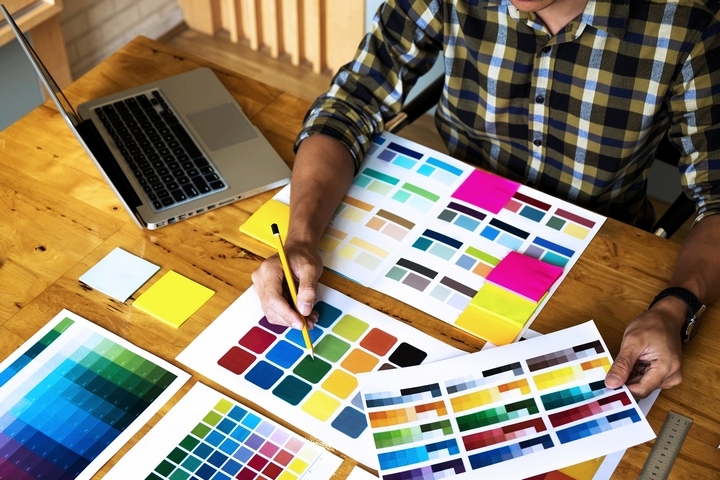
Colors used on a banner should be simplified, support your logo and brand image, and be complimentary on top of whatever the background color is. Keep in mind what colors mean. Black, for example, might be a little too ‘professional’ for a family-friendly event when you will usually want something more fun.
Red and orange draw a customer’s attention while greys are not usually recommended. Have some play with it and see what resonates with you.
6. Banner typography
Choose the right typography or font, matching it to your logo or brand. Once you have that set, ensure every word you write on your banner is necessary. Every letter should be easily read as well.
Using too many fonts or sizes that are too small isn’t going to work in your favor. In fact, the typography you use and how you use it in your design can make or break your banner effectiveness.
7. Banner spacing
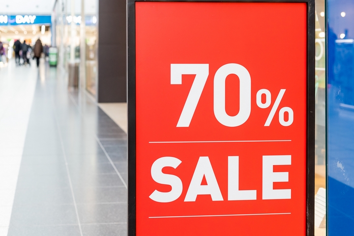
Between the logo, writing, images, and graphics you’re using, ensure you don’t overpopulate a banner. Keep a sufficient amount of space between things. Everything should be easy to read, absorb, and process for someone walking by. The faster people understand your banner, the easier it’s going to be for you to nab any available leads or interested parties in close distance.
If there is not enough space on your banner, look at it. Is there any unnecessary information which doesn’t reinforce your brand message? If so, remove them. For example, things like your business address or contact number may not need to be included nor do certain social media links. Cluttered designs on a banner can be a killer. Know your aim and the specific action you want consumers to take when seeing your banner, and simplify the design down to only what’s absolutely pertinent.
8. Banner messaging

In the process of how to design a banner, we often focus on the physical elements present and there’s certainly reason for that. Aside from what’s physically there though, it’s equally important to carry a simple message. Let’s say you sell 15 unique products, what’s there unifying theme – you don’t want overpowering clustered bullet points confusing anyone. Keep it simple down to the language used and the products you’re advertising.
You don’t want to design a banner that is completely removed from your other marketing materials. There should be some synergy. What’s displayed on the banner should match to brochures, any table cover you might be using, and any other branded products.
9. Banner keywords
If you had 10 words or less to sell someone on your brand, what would those be? A persuasive banner advertisement oftentimes will make use of these keywords. It can be a special deal like ‘6 free months!’ or ‘Savings up to $1,500 a year!’. It can keywords like ‘hot’, ‘tasty’, ‘delicious’, or ‘spicy’. It can be almost anything. Depending on your category of business, with your banner design, think of how you’ll persuade someone walking by to come and visit you.
